Boostrap Lab 2 + practice
As I have mention in the previous
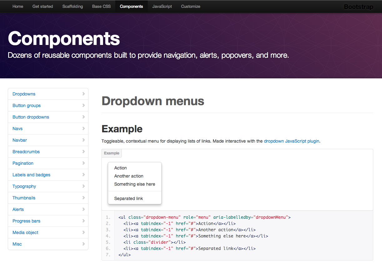
post, Bootstrap has many built-in components whose styles can be applied to your HTML as you name your divs a certain way. Let's explore its Base CSS and available Components. Checkout the full list of all of the built-in styles and components on
Bootstrap Website.
Let's go through a simple example. Here is an assignment from my awesome co-worker at that time
Kevin Husler:
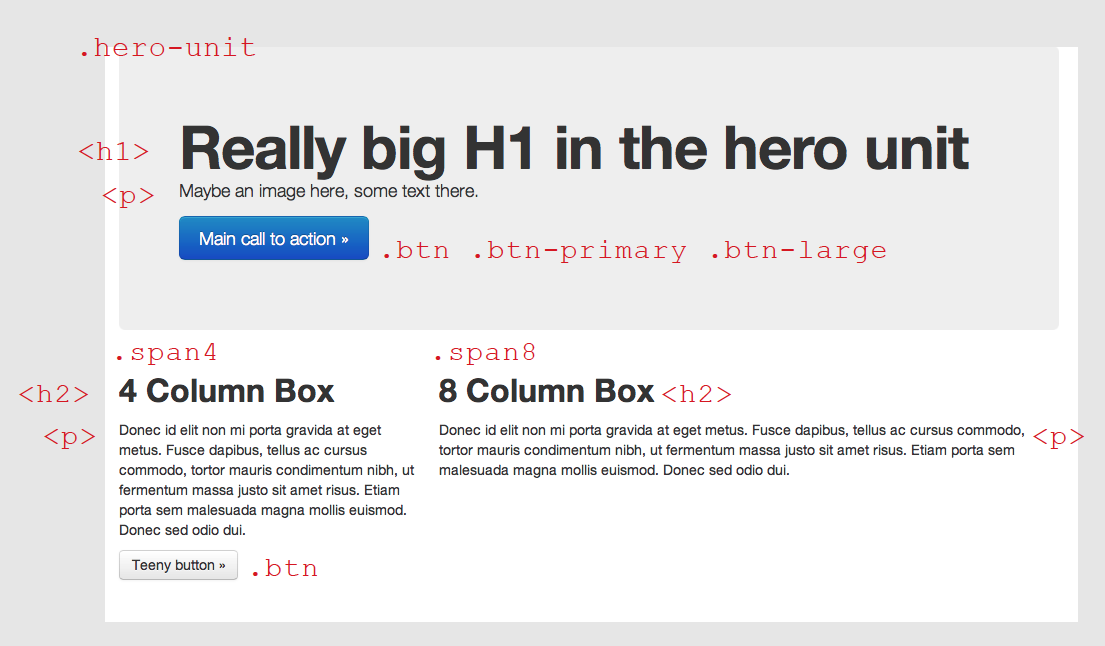
- Row 1: You can see we have a simple header and some test. It has a .span12 and class .hero-unit applied to it. In addition, we have a simple button which is an anchor tag with .btn class applied to it. There is a .btn-primary class for a blue colour and .btn-large to make the button bigger. For alternative colours and sizes checkout the Bootstrap Base CSS. The hero unit is basically the direct example from Bootstrap documentation.
- Row 2: The second raw is divided to two columns and have one more button. This time it is just a default button design when you only .btn class. Feel free to play around and customize the design.
Now, you are all set to stylize your webpage. As a practice, try the following example (see the picture below). Hints:
- There are four responsice rows (.row-fluid class)
- A .navbar on top
- A .glythicon for the calendar icon on the button
- Three .thumbnails
- A footer text with responsive utility classes applied to it which allows to adapt the style to different screen sizes.
Notes
- Here is the HTML of the practice for your reference.
- I've taught Bootstrap while working as a Teaching Assistant for Interface Design course in Spring 2013.
- Here is a link for the first tutorial presented in this blog.
Comments