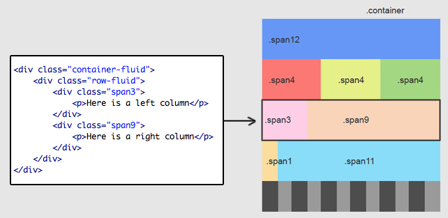
12-column grid
Bootstrap provides a 12-column grid system. Your webpage layout depends on the grid classes that you apply to your divs.
For a simple two column layout, we are going to create a row [div with .row (or .row-fluid) class]. Then, add the desired number of columns [tags with appropriate .span* classes]. Note that numbers in .span* should always add up to 12 for each row (or the number of columns in the parent tag).
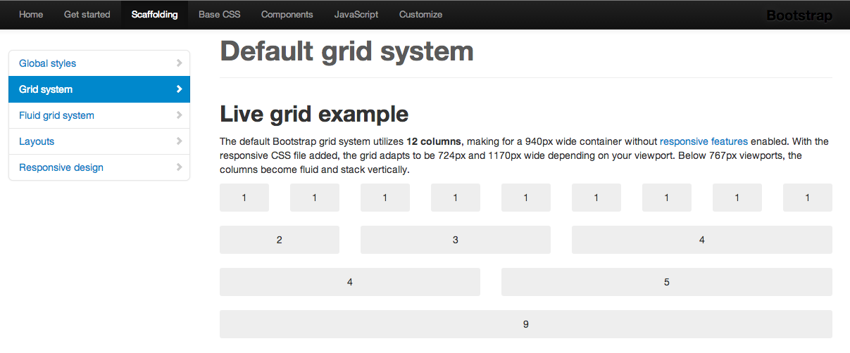
 For a detailed documentation on grid and fluid-grid systems in Bootstrap visit the Bootstrap Scaffolding page.
Lab 1 practice
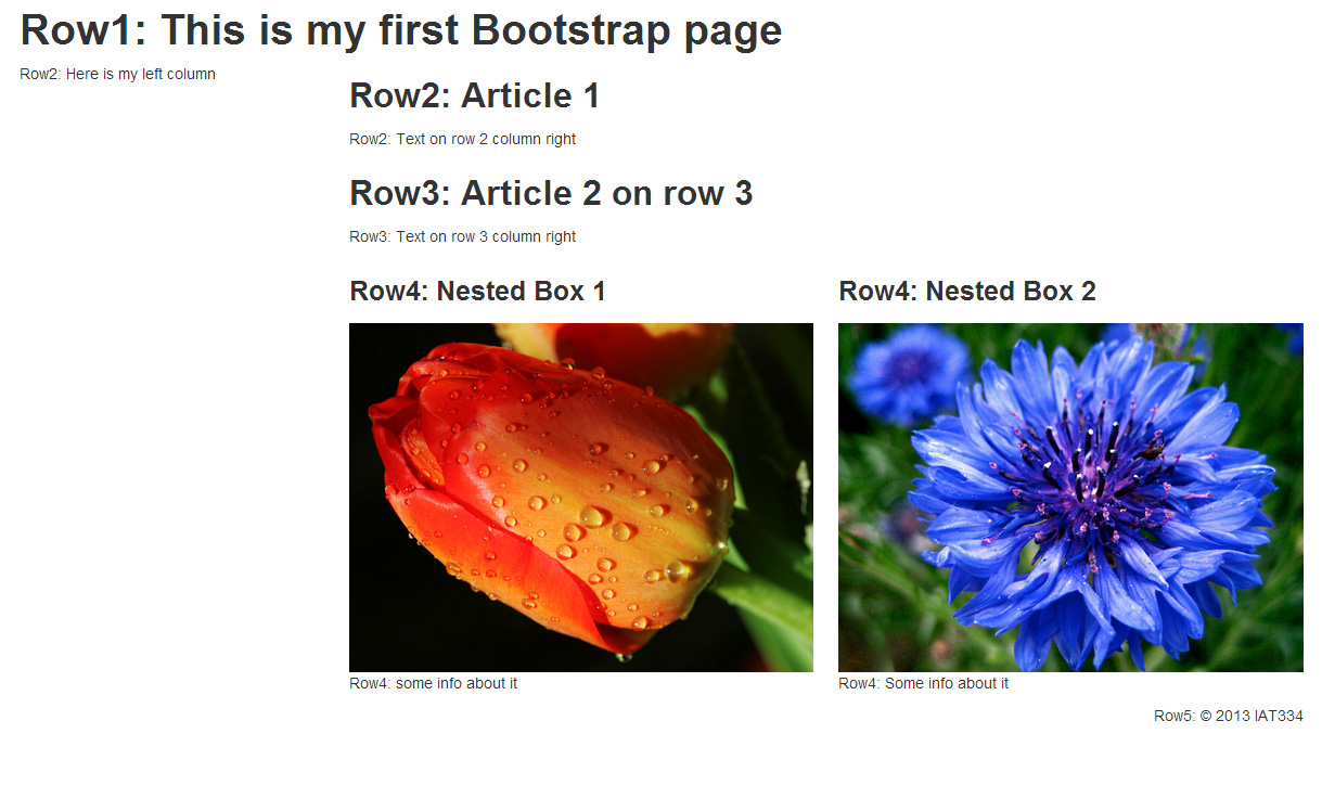
Bootstrap has many built-in components whose styles can be applied as you name your divs a certain way. As a practice, you can recreate the following simple layout (see the picture below) with any two images you want. It has 5 rows:
- Row 1: the header spans across 12 columns (i.e. apply .span12)
- Row 2: is a simple .span3 and .span9 with some paragraph and header text
- Row 3: there is no first column and the content is offset to the second column - .span9 .offset3. Checkout Bootstrap Scaffolding for more examples on offsetting.
- Row 4: has an offset and two nested columns. Checkout Bootstrap Scaffolding for documentation on nesting columns.
- Row 5: has an offset column (.span2 offset10) and has a .pull-right class applied to it.
Notes
- Here is the HTML of the practice for your reference.
- I've taught Bootstrap while working as a Teaching Assistant for Interface Design course in Spring 2013. You can download my presentation slides for lab 1 for your reference.
- Here is a link for the first tutorial presented in this blog.
Comments